The last notifications library
you'll ever need.
Zero setup. Fully customizable. It just works — from React to plain HTML.
Why KD Notifications?
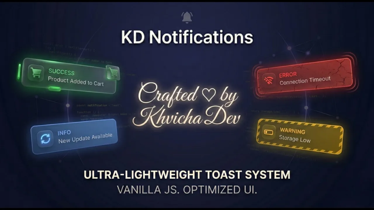
Lightweight & Fast
No dependencies, no external CSS. A fully self-contained library that injects its own styles and loads instantly.
Fully Customizable
Colors, positions, animations, icons, and themes — all configurable with CSS variables or the style API.
XSS Protected
Built-in DOM-based sanitization with strict whitelisting, SVG/Math blocking, and control-character filtering.
Smart Auto-Theming
Automatically detects your page's background color and system preferences to match Light or Dark mode seamlessly.
WCAG Accessible
Focus trap, automatic focus restoration, Esc-key dismiss, and prefers-reduced-motion integration out of the box.
Mobile-Ready
Fully responsive layout with native Safe Area support for notches, Dynamic Island, and all modern screen cutouts.
Promise-Based API
Every notification returns a Promise. Build interactive confirmation dialogs with async/await or .then() chains.
Smart Positioning
Place toasts anywhere on screen with strict CSS unit validation for custom offsets (px, em, rem, vh, vw).
Interactive Playground 🧪
Configure, preview, and copy ready-to-use code — use it directly in your project
Quick Start Guide
NPM (Recommended)
CDN (Direct Browser Usage)
jsDelivr
unpkg
ES Module Import
Modern bundlers (Webpack, Vite, React, Vue)
Native Browser ES Module
Basic Usage
// No extra CSS required! Styles are auto-injected.
KDNotification.show({
  type: 'success',
  title: 'Profile Updated',
  message: 'Your changes have been saved.',
  duration: 4000,
  position: 'top-right'
});
API Configuration Options
| Option | Type | Default | Description |
|---|---|---|---|
| type | String | 'info' | 'info' | 'success' | 'error' | 'warning' | 'processing' |
| title | String | '' | Optional title for a rich UI layout with icon |
| message | String | '' | Main content of the notification (Safe HTML supported) |
| duration | Number | 3000 | Auto-dismiss time in ms (0 disables auto-dismiss) |
| position | String | 'center' | 'center' | 'top-left' | 'top-right' | 'bottom-left' | 'bottom-right' |
| theme | String | 'auto' | 'auto' (detects background) | 'light' | 'dark' |
| isModal | Boolean | false | Blocks background interaction; requires manual dismissal |
| buttons | Array | null | Array of { text, value, className, onClick } objects |
| icon | String | null | Custom SVG string to override the default icon |
| style | Object | {} | Custom inline CSS properties or CSS variables |
| offsetX / offsetY | String | Number | '50px' | Distance from screen edges (supports px, em, rem, %, vh, vw) |
Methods
| Method | Returns | Description |
|---|---|---|
| KDNotification.show(options) | Promise | Displays a notification. Resolves with the clicked button's value, or null/true on auto-dismiss |
| KDNotification.close() | void | Programmatically dismisses the active notification. Ideal for hiding processing toasts after an API call finishes |
Button Styles
kd-btn
Default neutral button
kd-btn-primary
Primary action with gradient
kd-btn-danger
Destructive action with red gradient
Framework Compatibility
Browser Support
CSS Customization
| Variable | Default | Description |
|---|---|---|
| --kd-toast-anim-duration | 250ms | Enter/leave animation speed (parses both s and ms) |
| --kd-z-toast | 2147483647 | Z-index of the toast overlay |
| --kd-mobile-offset-x | 12px | Horizontal distance from edges on mobile |
| --kd-mobile-offset-y | 16px | Vertical distance from edges on mobile |
| --kd-mobile-max-width | 420px | Maximum toast width on mobile devices |
💡 Use the style API or CSS variables for customization. Avoid targeting internal CSS classes directly, as they may change in future updates.